In this section of our ParaPro Study Guide, we will explore how to decipher information from data illustrations and measurements. Data analysis is an important skill to possess to make the best judgments based on data trends — and, of course, it is a core topic tested on the ParaPro Exam.
Data Displays
Charts, graphs, and tables are crucial forms of measurement and displays of important data. There are many different types of data displays, some of which we will touch on in this unit: tables, bar graphs, line graphs, and pie charts are all covered below.
How to Read a Table
Tables are used to organize data in rows and columns for readers to process information. For example, consider the following table of middle school students’ free time throughout the week:
Students’ Amount of Free Time (Hours) Throughout The Week
| Mon | Tue | Wed | Thu | Fri | Sat | Sun | |
| Mary | 4 | 4 | 4 | 4 | 8 | 12 | 3 |
| Perry | 5 | 4 | 5 | 4 | 5 | 4 | 4 |
| Olly | 3 | 3 | 3 | 3 | 5 | 7 | 7 |
The grid design of a table allows us to categorize information by two factors, one going up and down (the columns) and one going left to right (the rows). You can find specific values by following the column and row to where they meet, or you can compare values across different columns and rows.
If a question were to simply ask how much free time Perry had on Thursday, we would follow along Perry’s row to the point where it intersects the Thursday column to get the answer: Four hours.
Example 1
Out of the three students, who has the most free time throughout the week?
To determine our answer, we must add up the hours of free time for each student, following their respective rows:
Mary: $4 + 4 + 4 + 4 + 8 + 12 + 3 = 39$ hours
Perry: $5 + 4 + 5 + 4 + 5 + 4 + 4 = 31$ hours
Olly: $3 + 3 + 3 + 3 + 5 + 7 + 7 = 31$ hours
Mary has the most free time throughout the week.
How to Read a Bar Graph
Bar graphs are used to visualize data from different categories in order to make comparisons. Consider the following bar graph of middle school students’ math test scores between different marking periods:
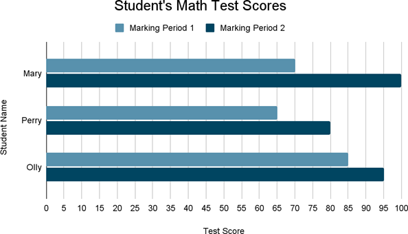
In the graph above, we have the test scores on the $x$-axis and the students on the $y$-axis. You can remember that the $x$-axis is horizontal and the $y$-axis is vertical with the mnemonic “$y$ goes high in the sky,” since the $y$-axis points upward.
Bar graphs vary widely in style. The $x$-axis and $y$-axis can be flipped in some cases to give a different visual appeal. In the graph above, the “bars” come from the $y$-axis and are read using the $x$-axis. Other bar graphs will have the bars come from the $x$-axis and be read using the $y$-axis. Some bar graphs will have just one bar per category, whereas others, like the one above, will have two or more, so that you can compare data in more than one way; we can compare Perry’s performance to Olly’s, or we can compare Perry’s performance against himself over time.
Example 2
What is Mary’s average math test score for marking periods $1$ and $2$?
To calculate Mary’s average test score, we need to pinpoint both her marking period scores. From the bars next to Mary’s name, we see the first bar goes to $70$. This is what Mary scored on the marking period $1$ test. The second bar goes to $100$. This is what Mary scored on the marking period $2$ test. Now we can find the average of these two numbers:
$(70 + 100) ÷ 2 = 85$
Mary’s test score average is $85$.
How to Read a Line Graph
Line graphs are used to show trends in data over a period of time. Consider the following line graph of Mary’s happiness level throughout the school day:
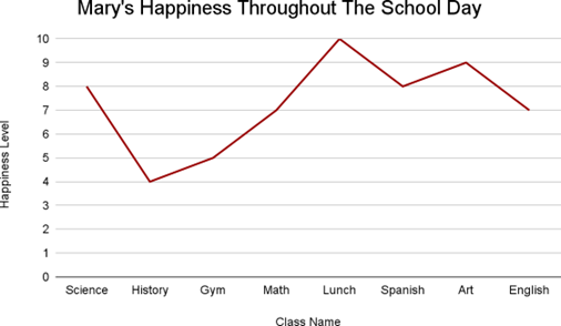
In the line graph above, the time on the $x$-axis is divided by what class Mary is in at specific points of the day so that we can align her happiness with her activity. The variable we are measuring, her happiness level, is shown on the $y$-axis. The line represents fluctuations in Mary’s happiness.
Example 3
How much does Mary’s happiness level increase from history class to lunch?
To determine our answer, we need to pinpoint her happiness level at these two points in time. Looking at the line graph, we can see that Mary’s happiness level is at a $4$ during history class. If we follow the line along to lunch, we can see that Mary’s happiness level is at a $10$. To find the amount that Mary’s happiness increased, we subtract the history happiness level from the lunch happiness level:
$10 − 4 = 6$
Mary’s happiness increased by $6$ from history class to lunch.
How to Read a Pie Chart
Pie charts show the percentage breakdown of a whole measurement of data. Consider the following pie chart of the hourly breakdown of Perry’s Saturday activities:
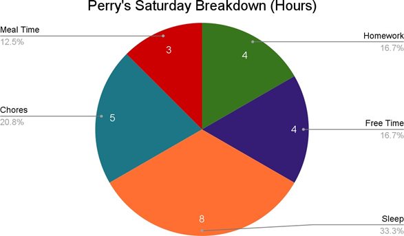
Pie charts are the best way to visually represent percentages. When adding up a pie chart, all sections together will equal $100$%, because together they make the whole pie. Larger percentages will take up larger sections of the pie, as we can see with “Chores” being visually larger than “Meal Time” above.
In pie charts, the data will be written out as a percentage, a fraction, or, in some cases, in degrees. The above pie chart represents time in hours, so the “Free Time” slice is labeled $4$ to represent $4$ hours, but it is also labeled with the percentage of time that $4$ hours is in a day.
Example 4
What activity takes up a third of Perry’s Saturday?
We want to determine which single activity takes up a third of the day. This means we need to find the activity that takes one third of $24$ hours. Visually, sleeping takes up a relatively large portion of Perry’s day, so we can start here. Perry sleeps for $8$ hours on Saturday. We can check the proportion of hours of sleep to the hours in the day by observing the ratio $\frac{8}{24}$. Because $24$ is divisible by $8$, we can divide the numerator and denominator by $8$, simplifying the ratio to $\frac{1}{3}$. Thus we have confirmed that sleeping takes up a third of Perry’s Saturday.
Measures of Center
Another way to analyze data is by calculating the mean, median, and mode of a data set. Mean, median, and mode are three different measurements of center. Let’s look into each of these measurements more closely.
Mean
The mean is the average of the numbers included in a data set. The mean is calculated by adding each value in the data set and dividing by the total number of values.
Example 5
Find the mean of the following data set.
Consider the following scores of middle school students’ history tests in the first marking period:
Middle School Students’ History Test Scores in Marking Period 1
70, 85, 70, 50, 80, 100, 90, 75, 80, 90
We will first add all the numbers in the data set together: 70 + 85 + 70 + 50 + 80 + 100 + 90 + 75 + 80 + 90 = 790
Now, we must divide by the number of values in the data set. Because there are 10 test scores listed in the data set, we will divide 790 by 10:
790 ÷ 10 = 79.0
The mean of the data set is 79.
Median
The median is the middle value when all values are arranged from least to greatest. When there is an even number of values in the data set, the median is the average of the two middle values, which ensures that the median is the true middle value.
Example 6
Find the median of the following data set.
Consider the following scores of middle school students’ history tests in the first marking period:
Middle School Students’ History Test Scores in Marking Period 1
70, 85, 70, 50, 80, 100, 90, 75, 80, 90
In order to find the median, we will first reorder the scores from least to greatest:
50, 70, 70, 75, 80, 80, 85, 90, 90, 100
Now we can determine the middle value of the data set. Because we have an even number of values, we will need to calculate the average of the two middle values.
50, 70, 70, 75, 80, 80, 85, 90, 90, 100
The middle values in this data set are the 5th and the 6th terms because they are an equal distance from the end terms, the 1st and 10th terms, respectively. (In contrast, if there were 9 terms, the 5th term would be the sole middle term.)
The two middle values of this dataset are 80 and 80. We can find the average of these two numbers:
80 + 80 = 160
160 ÷ 2 = 80
The median of the data set is 80.
Mode
The mode is the value that appears the most in a data set. A data set can have more than one mode or none at all. It is a common misconception that the mode is the number that has the highest value, but this is incorrect.
Example 7
Find the mode of the following data set.
Consider the following scores of middle school students’ history tests in the first marking period:
Middle School Students’ History Test Scores in Marking Period 1
70, 85, 70, 50, 80, 100, 90, 75, 80, 90
In order to find the mode, we will determine how many times each value appears in the data set:
| Dataset Value | Amount of Times Value Appears in Dataset |
| 50 | 1 |
| 70 | 2 |
| 75 | 1 |
| 80 | 2 |
| 85 | 1 |
| 90 | 2 |
| 100 | 1 |
Because the values that show up the most in the dataset are 70, 80, and 90, all three of these values are the mode of the data set.
You should now have the background you need on data analysis, charts, graphs, and measures of center to complete the brief 5-question review test below.